Aer Lingus reveals first brand refresh for 20 years
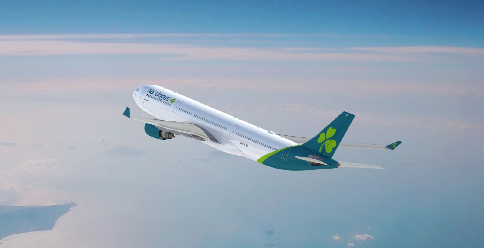
Aer Lingus today unveiled a refreshed brand with updated logo and new aircraft livery, which the airline said reflected its position as ‘a modern and contemporary Irish brand that competes on the international stage’.
The airline said the new brand identity supported its ambition to become the leading value carrier across the North Atlantic. Last September, the Aer Lingus announced two new transatlantic routes; Minneapolis St. Paul in the US and Montreal in Canada, bringing the total number of North American destinations it serves to 15.
The first Airbus A330 to sport the new logo will take to the skies on Friday, January 18. Flight EI105 will be met by a reception at New York’s JFK Airport. The first new liveried aircraft to appear in the UK will fly to Heathrow on Monday.
The new logo retains the iconic shamrock, but a tilt has been added ‘to symbolise dynamism and speed’ said the airline, and the leaves have become more heart-shaped ‘to reflect the warmth and hospitality of the brand’.
The Aer Lingus logo font has changed to ‘diodrum’ and the dominant colour is teal. The body of the new look Aer Lingus aircraft will be white with a teal-coloured tail and engines.
The teal undercarriage means that Aer Lingus will be instantly recognisable from the ground, said the airline.
The brand refresh is being rolled out across all brand platforms, with a new website design and new app design.
The refresh is part of the airline’s ambitious growth plan, which includes expanding its transatlantic fleet from 17 to 30 aircraft by 2023.

Overall, Aer Lingus plans to grow its A330 fleet to 16 aircraft (from 13 in 2017) and invest in 14 new A321LRs.
CEO Sean Doyle said: "Aer Lingus is a modern Irish international success story, built on hard work, enterprise and the commitment of our people. We’re delighted to unveil our brand refresh today, which comes more than 20 years after Aer Lingus last invested in new brand livery, and reflects our position as a modern, contemporary airline.
"Aer Lingus has had exceptional success in recent years: adding new routes, new aircraft, new jobs and new opportunities for colleagues and guests alike.
"The refreshed brand reflects an airline that connects those living in Montreal to Marseille; in Berlin to Boston; as well as those living in Cork to Croatia. The benefit for Ireland of being at the fulcrum of such connections is considerable and we in Aer Lingus are determined to realise this potential for Ireland.
"We have ambitious plans for our future and the years ahead, yet we are aware of challenges facing the modern industry and thus investment in our new brand identity and livery; our new uniforms which will be unveiled later this year; and our fleet expansion are considered investments in the future of Aer Lingus to enable us realise our ambition to be the leading value carrier across the North Atlantic."
Chief operating officer Mike Rutterer said: "We conducted extensive guest research across Ireland, Europe & North America to inform every key stage of the process to ensure that the brand revealed today is reflective of our value carrier positioning. This research confirmed the importance of our shamrock – the Irish emblem has been at the heart of the Aer Lingus brand for more than 80 years, and we made the shamrock ‘hearts’ more pronounced to reflect our hospitality and service.
"The new look Aer Lingus livery consolidates our position as a modern, contemporary Irish airline on the international stage, but also allows guests who have always loved our brand to maintain a positive affiliation."
 United Kingdom
 United States
 Asia Pacific













Dozens fall ill in P&O Cruises ship outbreak
Woman dies after getting ‘entangled’ in baggage carousel
Turkish Airlines flight in emergency landing after pilot dies
Boy falls to death on cruise ship
Protestors now targeting Amsterdam cruise calls